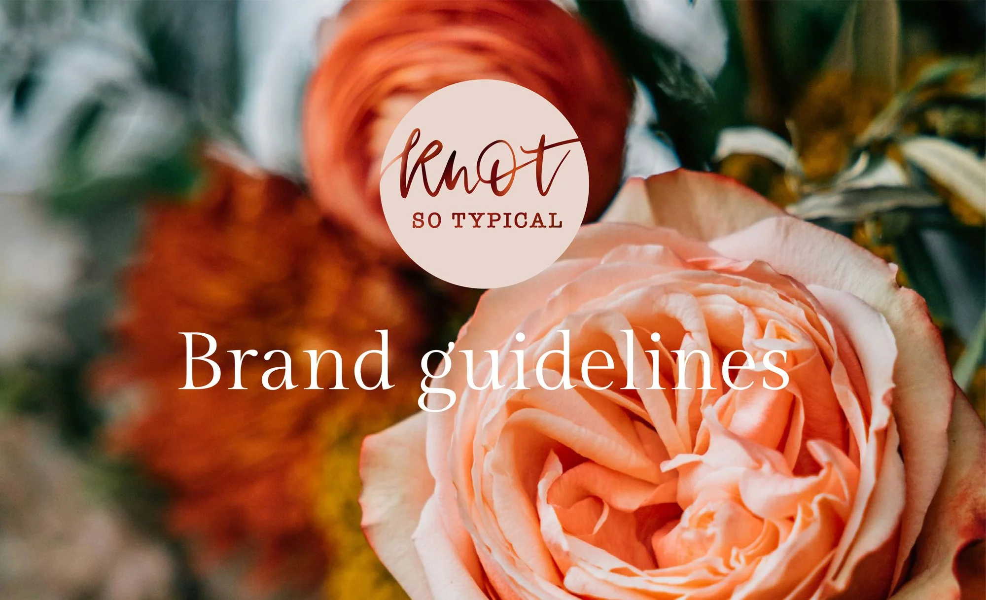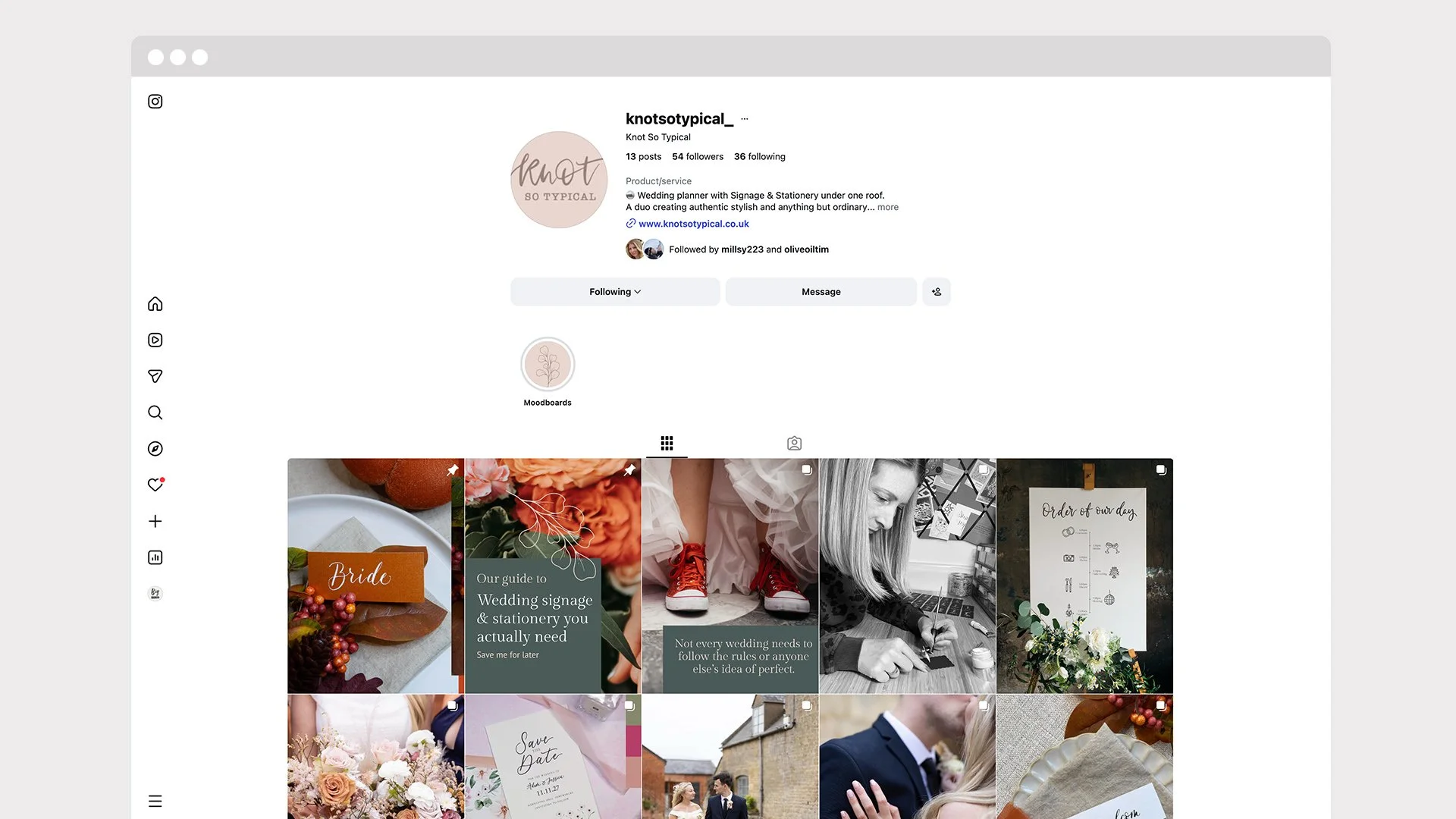
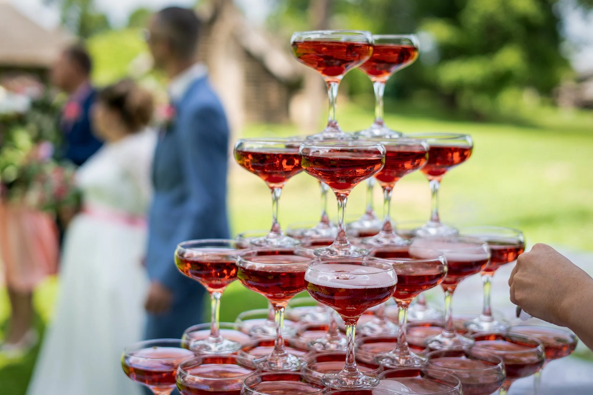
Knot So Typical is a wedding planning partner and signage & stationery studio – all under one roof
The mission
The mission: Create a distinctive brand identity for a business that celebrates weddings that are truly unique and personal, creative, stylish and stress free. The goal was to capture the brand’s playful yet elegant personality while ensuring it would resonate with modern couples looking for something unique.
The project included:
Logo design
Full visual identity system
Social presence
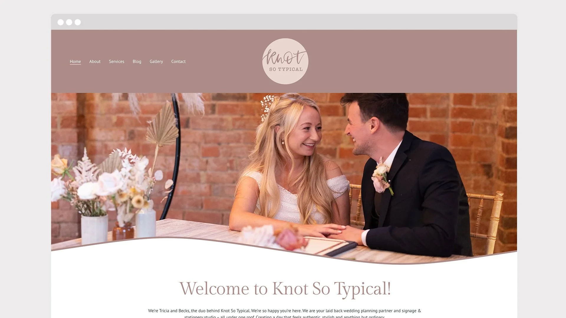
Website design
This was such a rewarding project to work on, I can’t wait to see Knot So Typical grow and be part of so many special wedding days.
Knot So Typical is a wedding planning partner and signage & stationery studio – all under one roof.
Helping couples confidently create weddings that reflect who they truly are: authentic, personal and knot so typical, through calm, thoughtful planning and considered design.
The detail
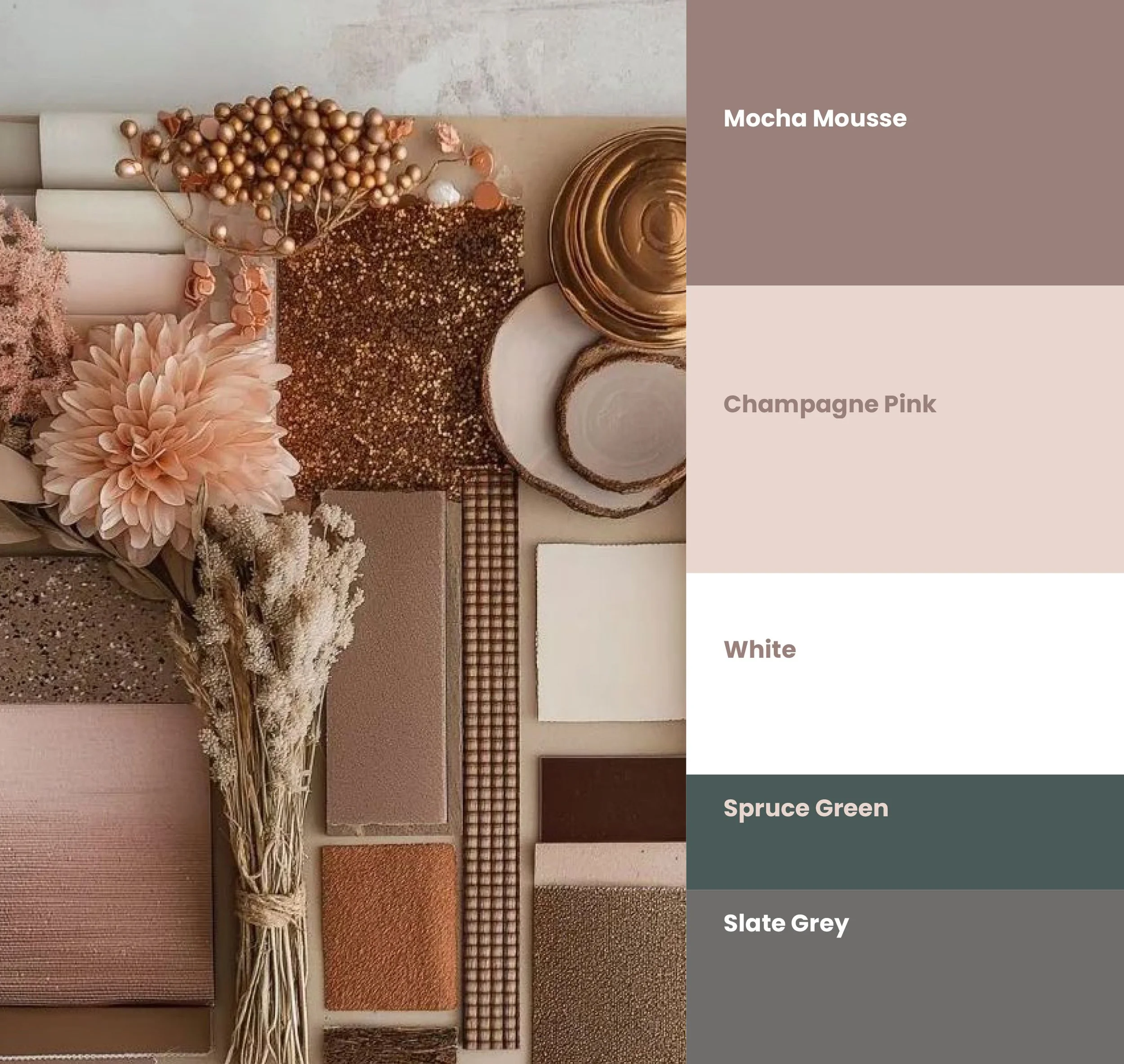
Colour
The colour palette draws inspiration from Pantone’s 2025 Colour of the Year, Mocha Mousse, chosen for its rich, grounded warmth. In colour psychology, tones like this evoke comfort, stability, and a natural sense of calm — qualities that align beautifully with the emotional significance of weddings.
The palette was designed to feel warm, sophisticated and timeless. Mocha Mousse introduces an understated elegance that feels modern yet enduring, adding a subtle sense of luxury without overwhelming the brand’s approachable personality.
In a commercial context, these tones also communicate reliability and trust, helping to create a reassuring and refined brand presence for couples planning one of the most meaningful moments of their lives.
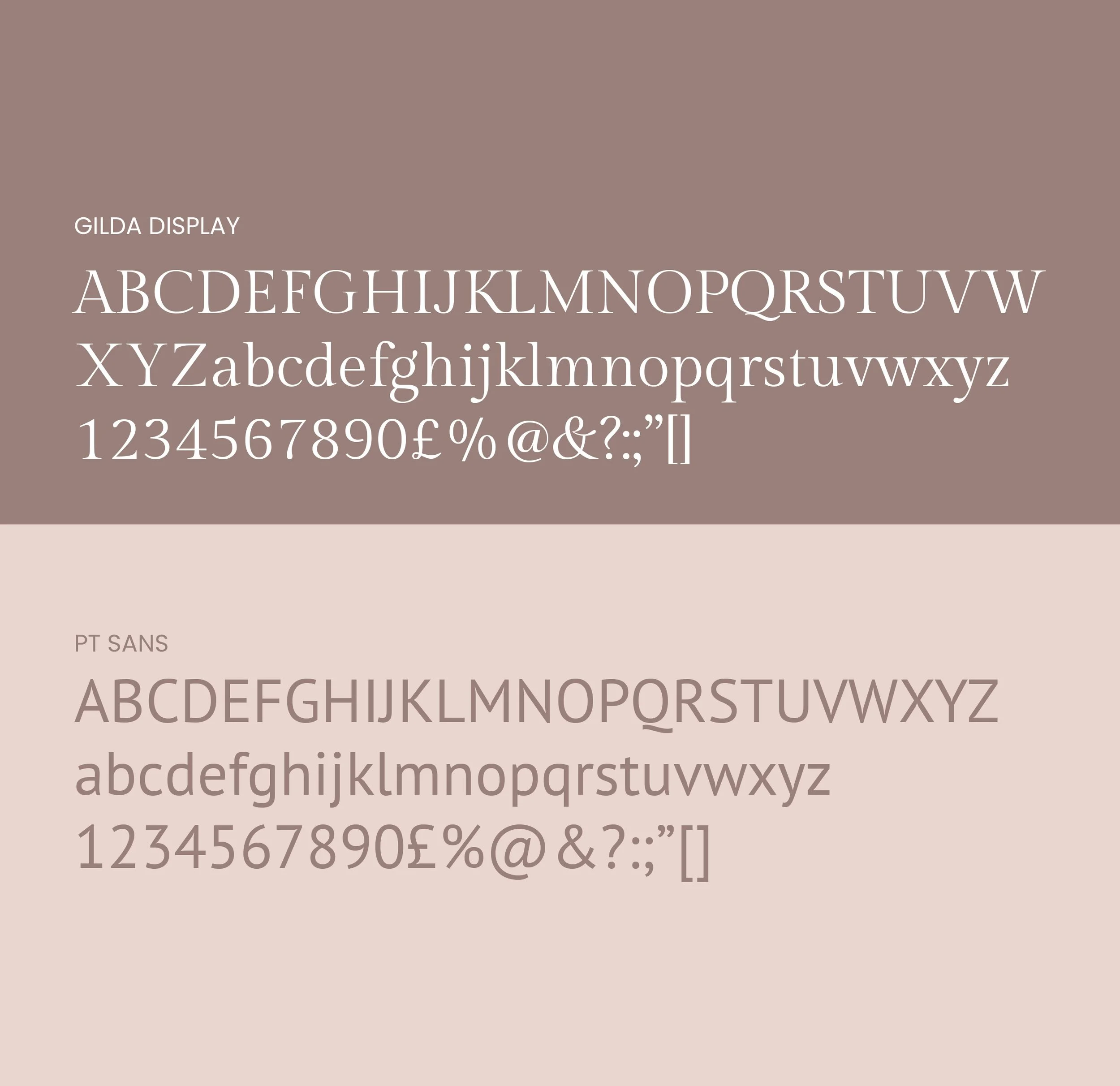
Typography
The typography for the brand was selected to create a balance between timeless elegance and modern clarity, ensuring the identity feels both refined and highly readable across all touchpoints.
Gilda Display is used for headlines and moments of emphasis, such as pull-out quotes or testimonials. Its elegant serif structure brings a sense of understated luxury to the brand, while its delicate letterforms work particularly well in lowercase, creating a softer contemporary feel while maintaining strong legibility.
Supporting font is PT Sans, a clean and modern sans-serif typeface used for body copy. Its simplicity ensures excellent readability while providing a subtle contrast to the more expressive headline font.
Together, these typefaces create a balanced typographic hierarchy, allowing the brand to feel sophisticated, approachable, and consistent across both print and digital applications.
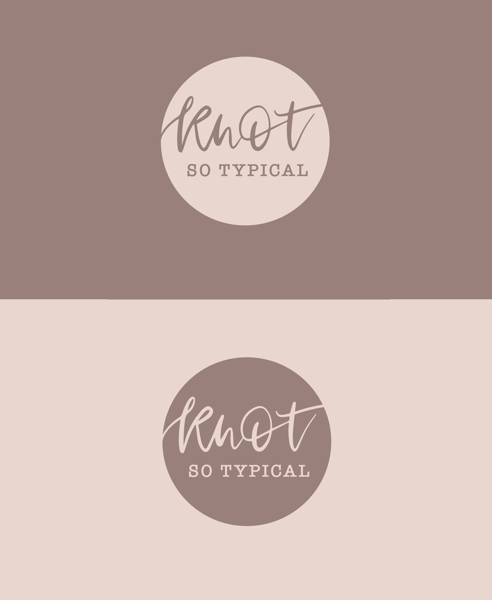
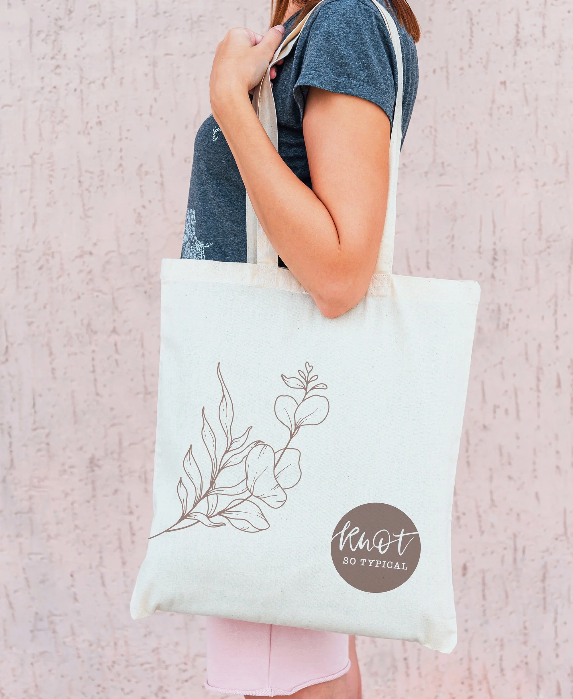
The identity
The logo combines bespoke hand-drawn typography, crafted by me, with the classic American Typewriter typeface to create a balance between personality and familiarity. This pairing was intentional , the custom lettering introduces warmth and individuality, while the supporting typeface provides structure and readability.
The softer edges and subtle imperfections celebrate the human touch behind the brand, offering a sense of authenticity and character in a landscape increasingly dominated by overly polished, automated design.
The roundel device acts as a unifying brand element, symbolising commitment, connection, and harmony values at the heart of the wedding industry. Beyond symbolism, it also serves a strategic purpose, creating a flexible and recognisable mark that can be used consistently across stationery, signage, and digital touchpoints.
Rather than designing a logo in isolation, the goal was to create a cohesive identity system — one that gives the brand the clarity, flexibility, and longevity needed to grow with the business.
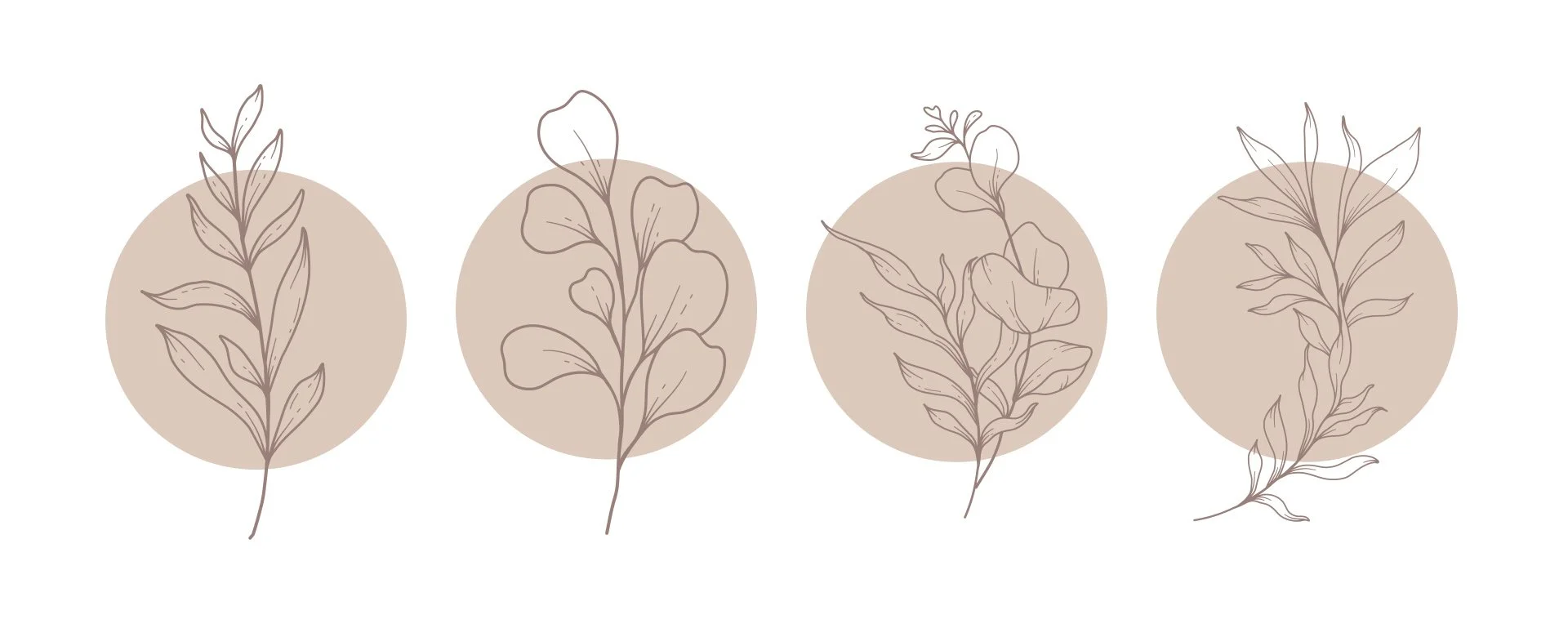
Illustrations
The botanical illustration styles are intentionally minimal and expressive, allowing them to feel modern while still retaining a handcrafted quality. Each illustration was created to feel organic and effortless, avoiding rigid or overly structured compositions.
If you know someone launching a business — or looking to elevate their brand so it truly stands out — work with a designer who is passionate about every detail. Get in touch 💜✏️