
Brand Identity
Brief
Create an identity for a passionate chef and foodie who offers restaurant-grade pizzas across the UK. Catering for special events, weddings and corporate events, occasionally popping up at local festivals and community events.
The Solution
Create a brand identity that stood out in a very competitive market, with many suppliers already offering handcrafted pizzas. Conducting interviews with key stakeholders to understand the brand vision and story, using his Greek/Cypriot heritage as his USP, and tapping into who would be his key target audience, in just three months I delivered:
Brand identity
Brand purpose and mission
Visual identity including illustrations
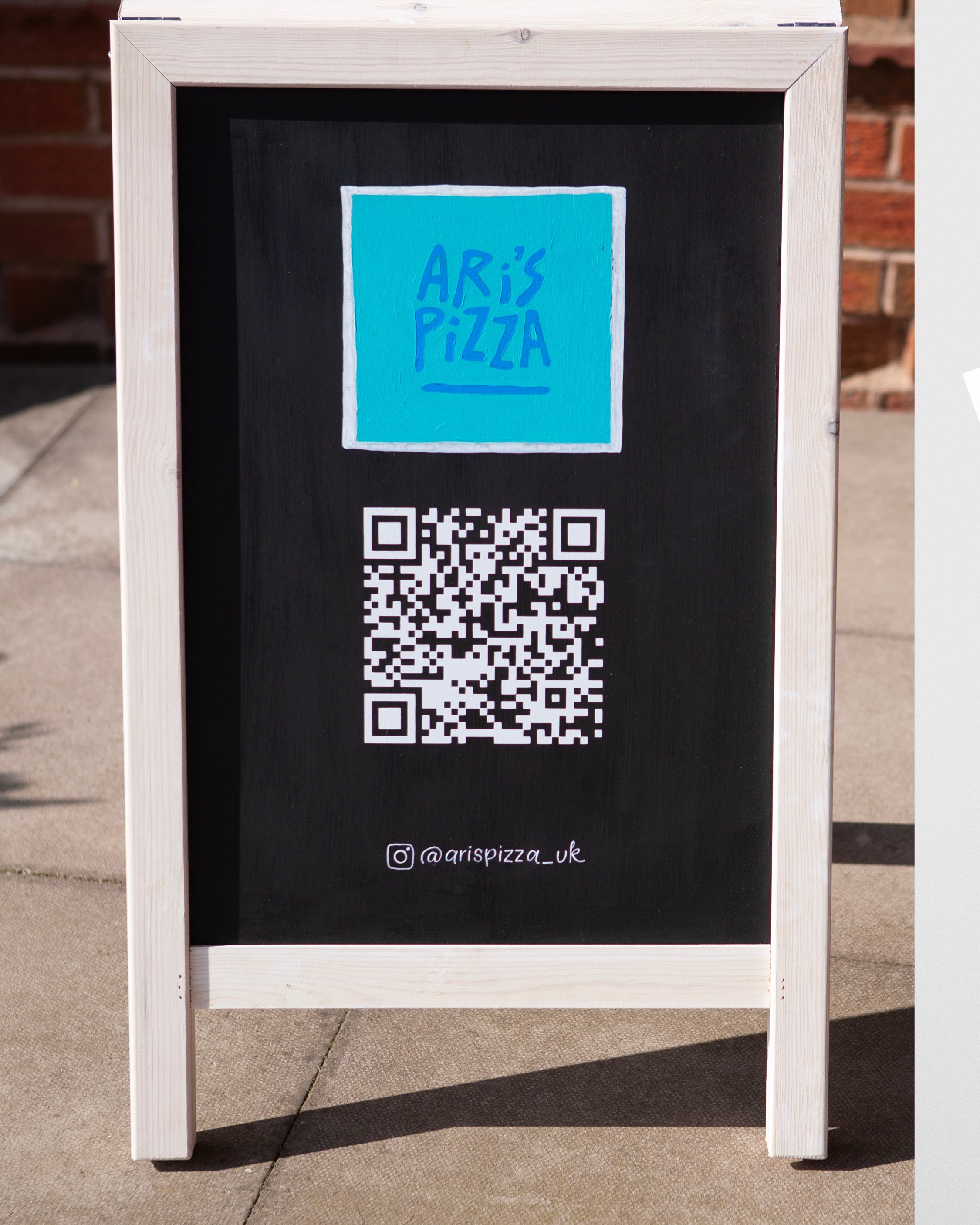
Hand-chalked Aboard Menu with QR code and custom painted logo by @big.littleideas
Hand-lettered pizza name mini chalk board easels and A5 arched standee
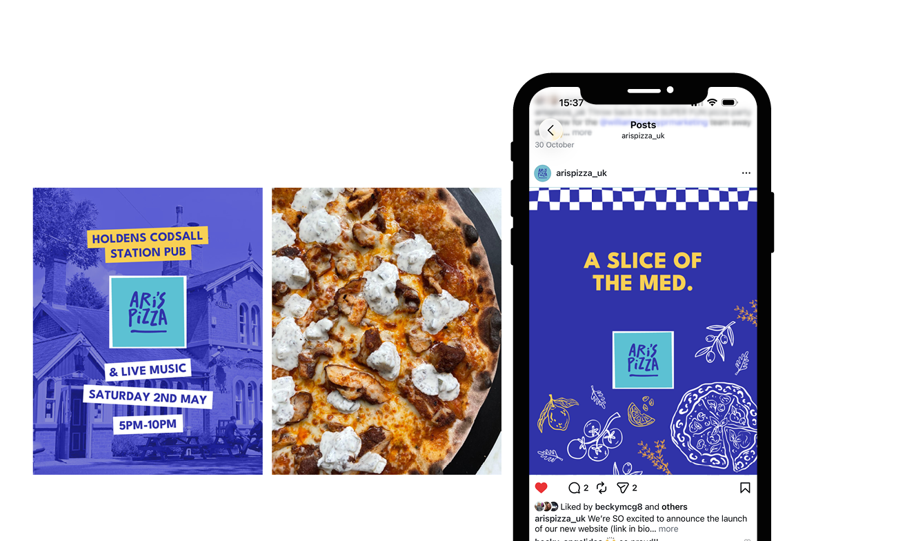
Social assets including start and end frames for Instagram reels
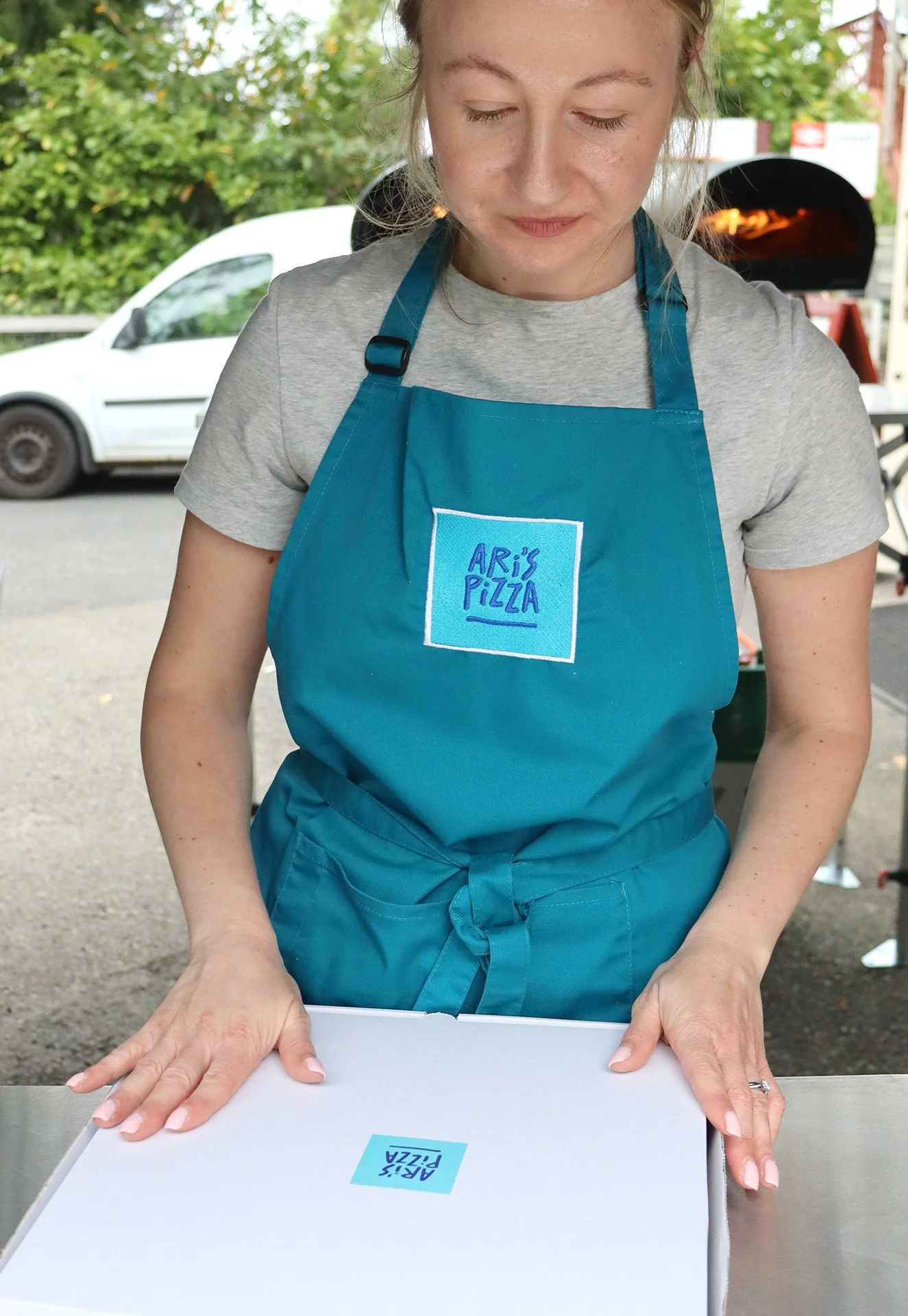
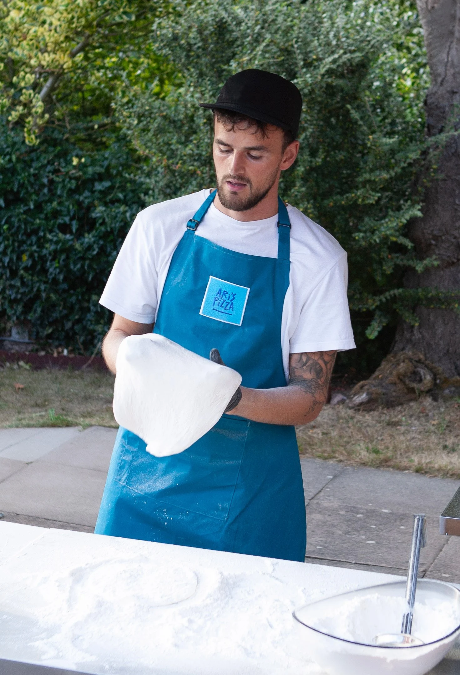
Chef aprons and Pizza boxes, including print management


Results
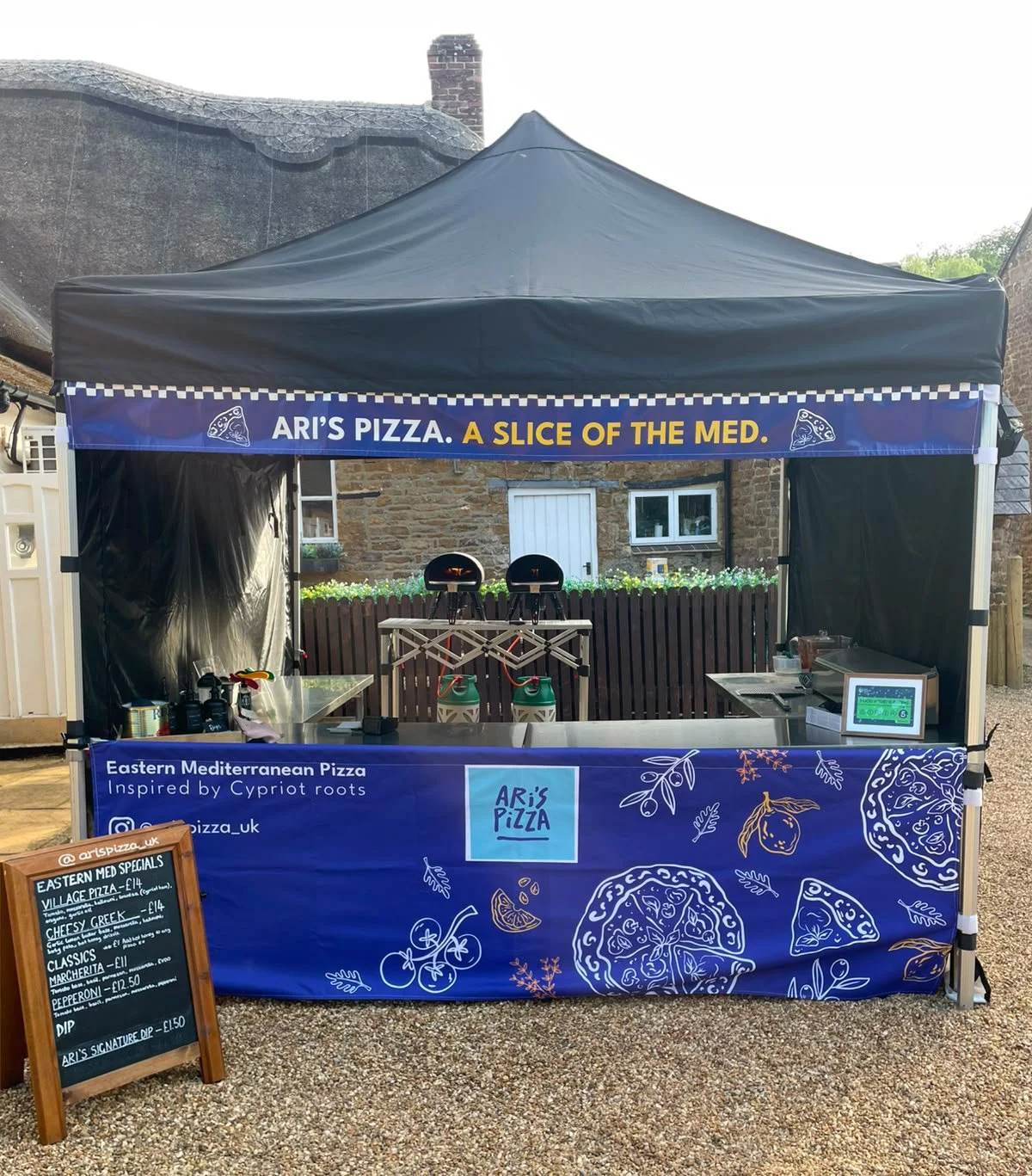
Client is very happy (which makes me happy), and he is excited for the rest of 2025, looking to expand his branding to include a gazebo and possibly a van.
2026 Summer update: his business is booming, securing regular local pop ups at pubs and festivals, with his instagram account growing from 350 to 500+ organically in 12 months.




The detail
Colour
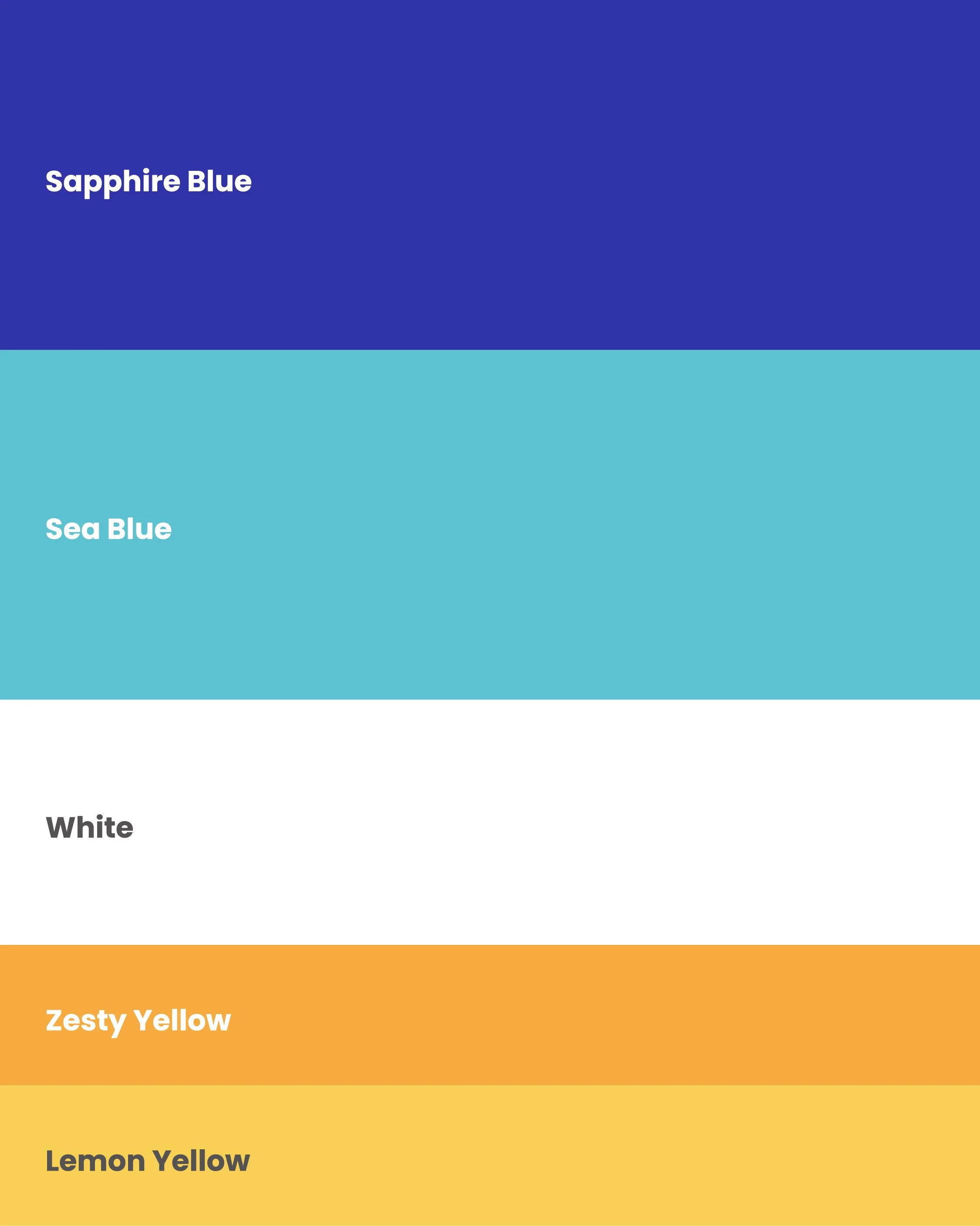
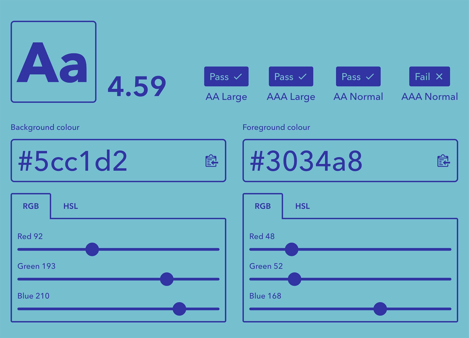
This colour palette takes inspiration from a tile from Mediterranean restaurant decor. These iconic med colours evoke Greek and Cyprus nostalgia. All colours were run through a contrast checker to ensure maximum readability.
Blue and white creates a sense of cleanliness and freshness. Adding a touch of yellow and orange can add vibrancy and energy. Yellow is also associated with hunger and happiness.
Typography
Typography plays a defining role in the personality of the Aris identity. I selected an uppercase wonky font as the expressive voice of the brand, using its letterforms to create a bold, handcrafted presence, giving the identity a sense of warmth, energy and individuality.
To provide balance and structure, I chose a clean, contemporary sans-serif supporting typeface providing clarity across supporting information, pull-out details and body copy.
Together, the typefaces create a considered typographic hierarchy, expressive where the brand needs to speak with personality, and clear where the message needs to be understood. The result is a system that feels confident, contemporary and crafted.
The identity
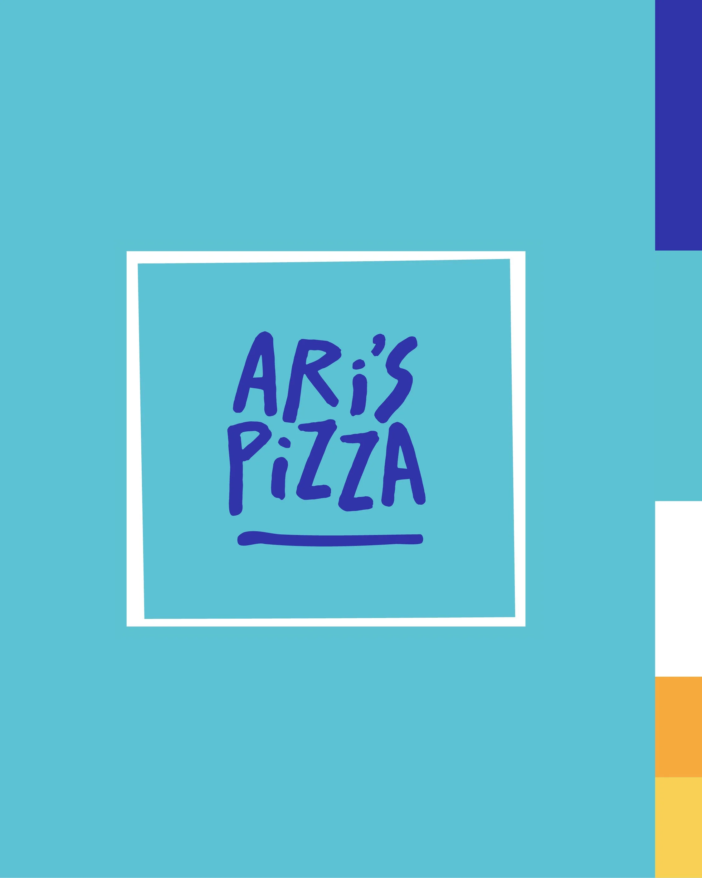
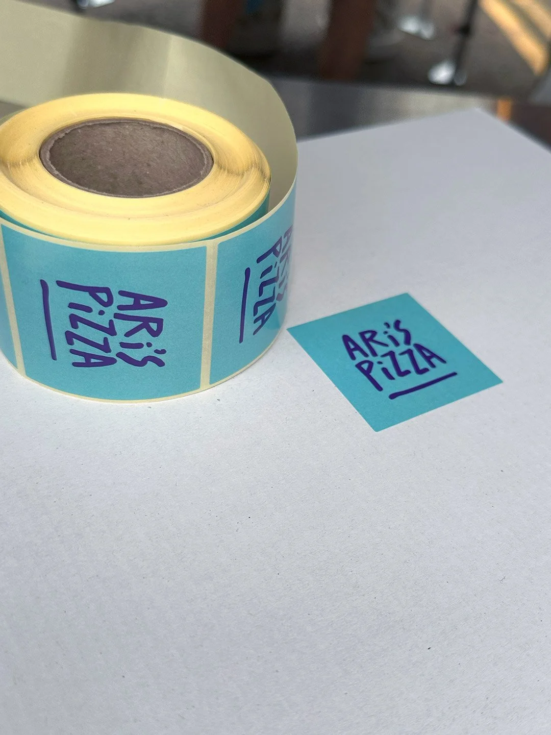
A hand-drawn logotype sits within a box whose clean yet imperfect lines subtly echo the shape of a pizza box. This balance of structure and playfulness reinforces the crafted, authentic feel.
The pairing of fresh blues with crisp white not only gives a nod to the Mediterranean heritage but also communicates freshness, confidence, and trust , qualities that make the brand feel both dependable and vibrant.
Illustrations
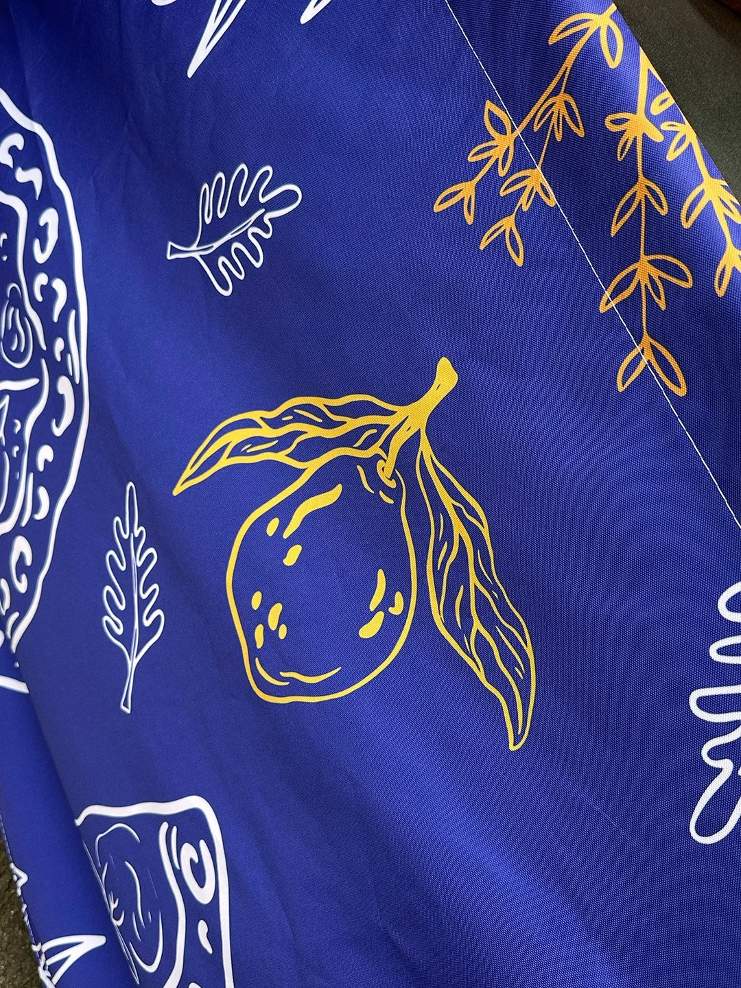
I chose a rustic, hand-drawn illustration style to reinforce the artisanal character at the heart of the Aris brand. Organic linework and intentionally imperfect edges bring a sense of warmth and authenticity, creating a visual language that feels crafted rather than manufactured.
The ingredient-led illustrations provide a natural extension of the brand’s handmade approach, adding personality and storytelling while complementing the expressive typography and wider identity. Their loose, tactile quality helps strike the right balance between rustic charm and contemporary design, ensuring the brand feels authentic without becoming overly traditional.
The illustration system will be developed further to create a distinctive and flexible library of assets that can be applied consistently across the brand’s wider touchpoints.