
Soft serve forecast
Brief
Comelle is an established name in the soft serve world, with strong awareness and category leadership. But with a new wave of younger, more premium brands entering the market, there was a challenge to overcome: Comelle was starting to feel a little old school.
The opportunity was to shift that perception and show that soft serve is about so much more than ice cream. The dessert café and parlour market is worth £500m+, with growth being driven by experience-led desserts, exciting flavours and new ways of enjoying a familiar favourite.
Working with William Murray to deliver this project, the brief was to create a trend report that would put Comelle at the forefront of that conversation, inspiring foodservice operators with what’s next in soft serve, rather than simply telling them what’s happening now.
The report was designed to launch at the Ice Cream & Artisan Food Show 2026, within Comelle’s own interactive Soft Serve Studio, a dedicated space expected to welcome 8,000 visitors across two days. It would also live beyond the show as a digital experience on Comelle’s website, introducing the first edition of a new series of Soft Serve Forecast guides.
The ambition was clear: reposition Comelle as a modern, innovative and culturally relevant soft serve brand, and establish them as a voice worth listening to when it comes to flavour, consumer behaviour and the future of dessert.
The Solution
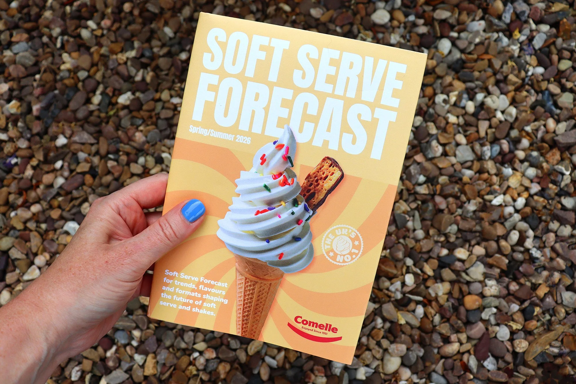
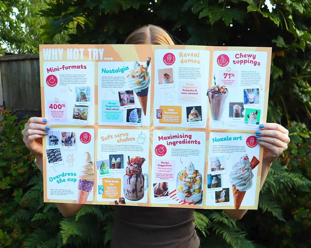
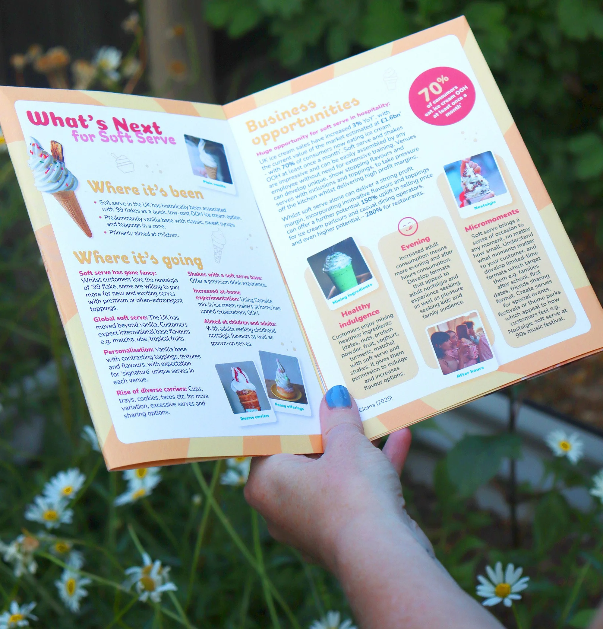
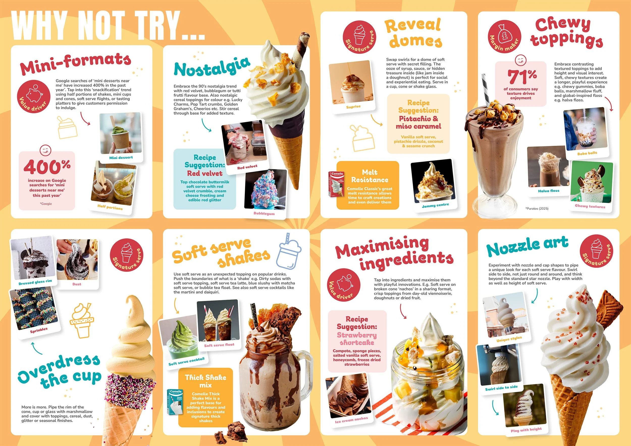
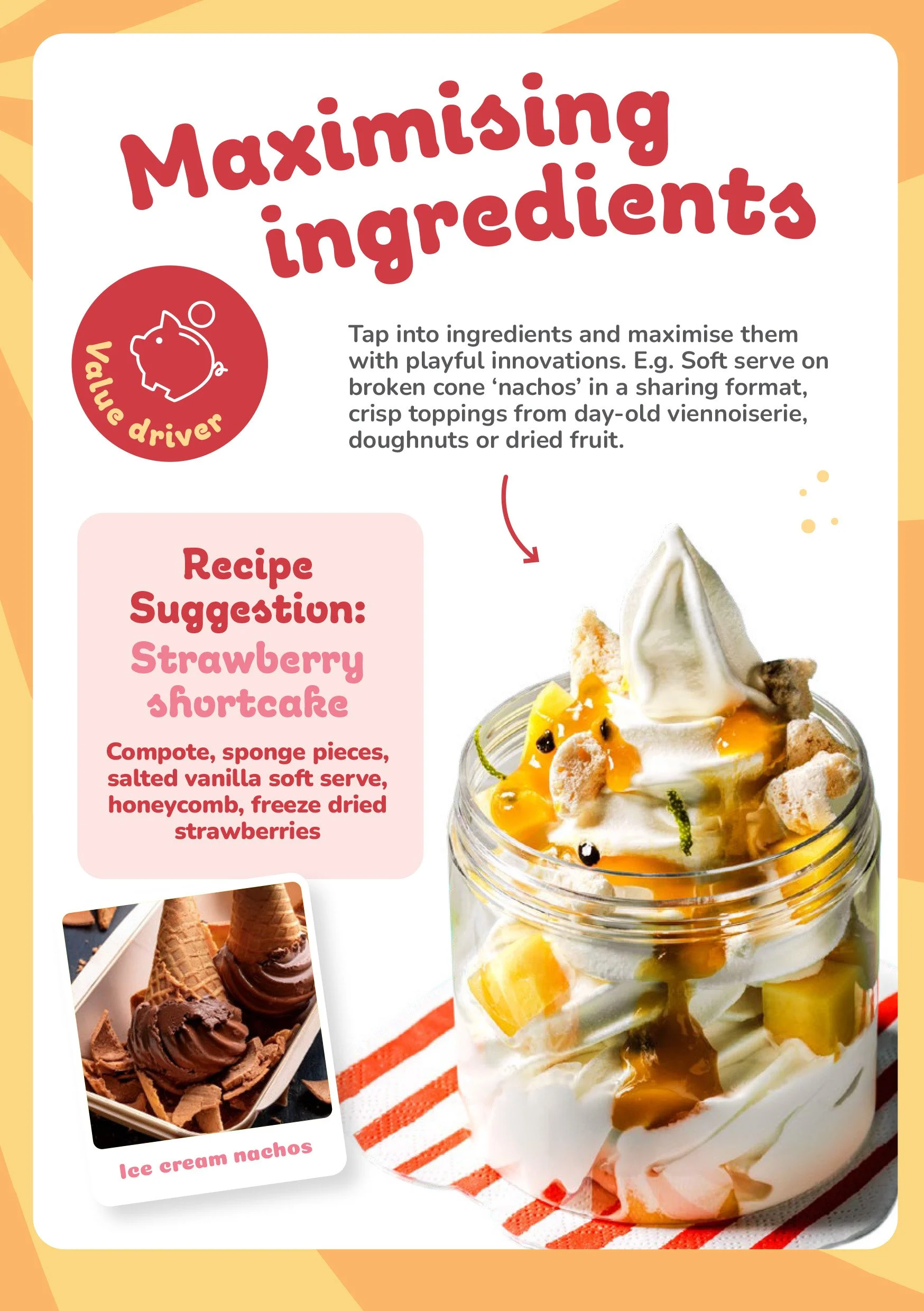
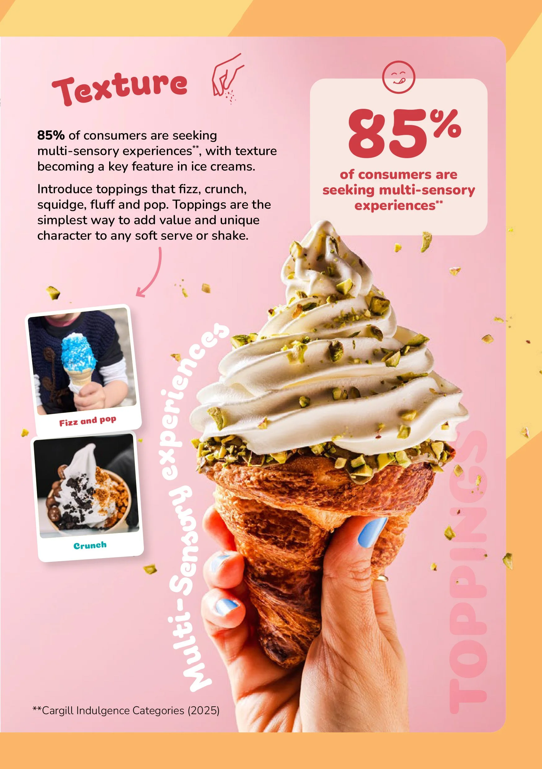
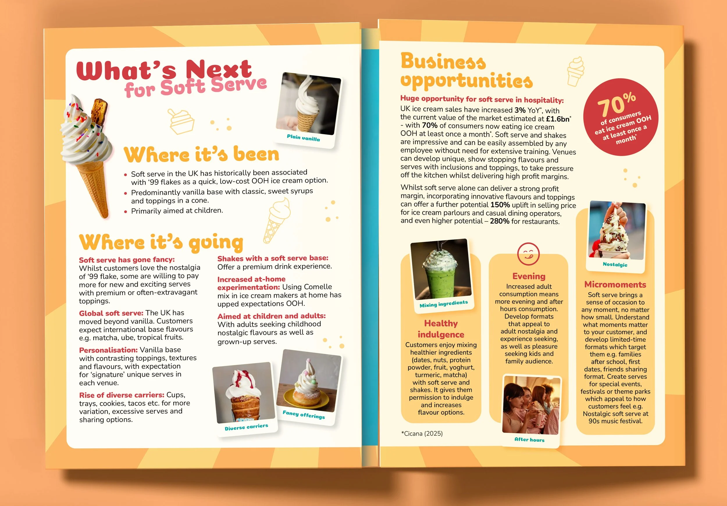
I designed an A2 folded trend report that transforms Comelle’s wealth of insights, statistics and data into something genuinely engaging, colourful, visual and easy to digest, while shifting the brand into a more contemporary, trend-led space.
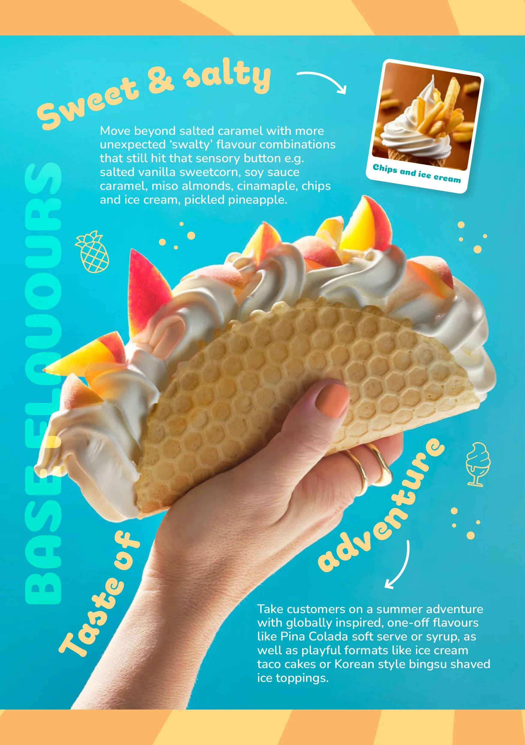
The format was designed to have a life beyond the exhibition. When fully opened, the report becomes a poster revealing the key Spring/Summer 2026 flavour trends and sensory experiences, giving visitors something worth taking away and, ideally, putting up on their walls long after the show.
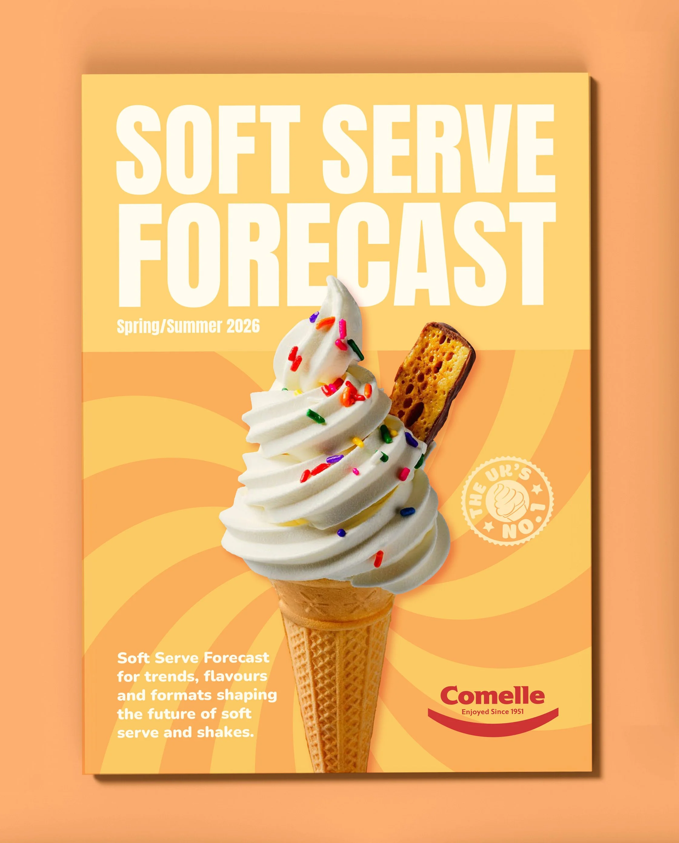
The visual direction uses a bright, energetic Spring/Summer palette, inspired by the optimism of sunshine, ice cream and seasonal flavour, while carefully working within Comelle’s existing brand colours. The result feels fresh and distinctive without losing the connection to the parent brand.
As this was the first in Comelle’s new Soft Serve Forecast series, I also had to think beyond a single edition. The identity was developed as a flexible visual system, with enough structure to create consistency across future guides, while allowing the creative direction to evolve with the seasons, from Autumn/Winter through to 2027 and beyond.
*Video featured above is Quantums video captured and edited by them.
Delivered
A2 printed and digital trend report
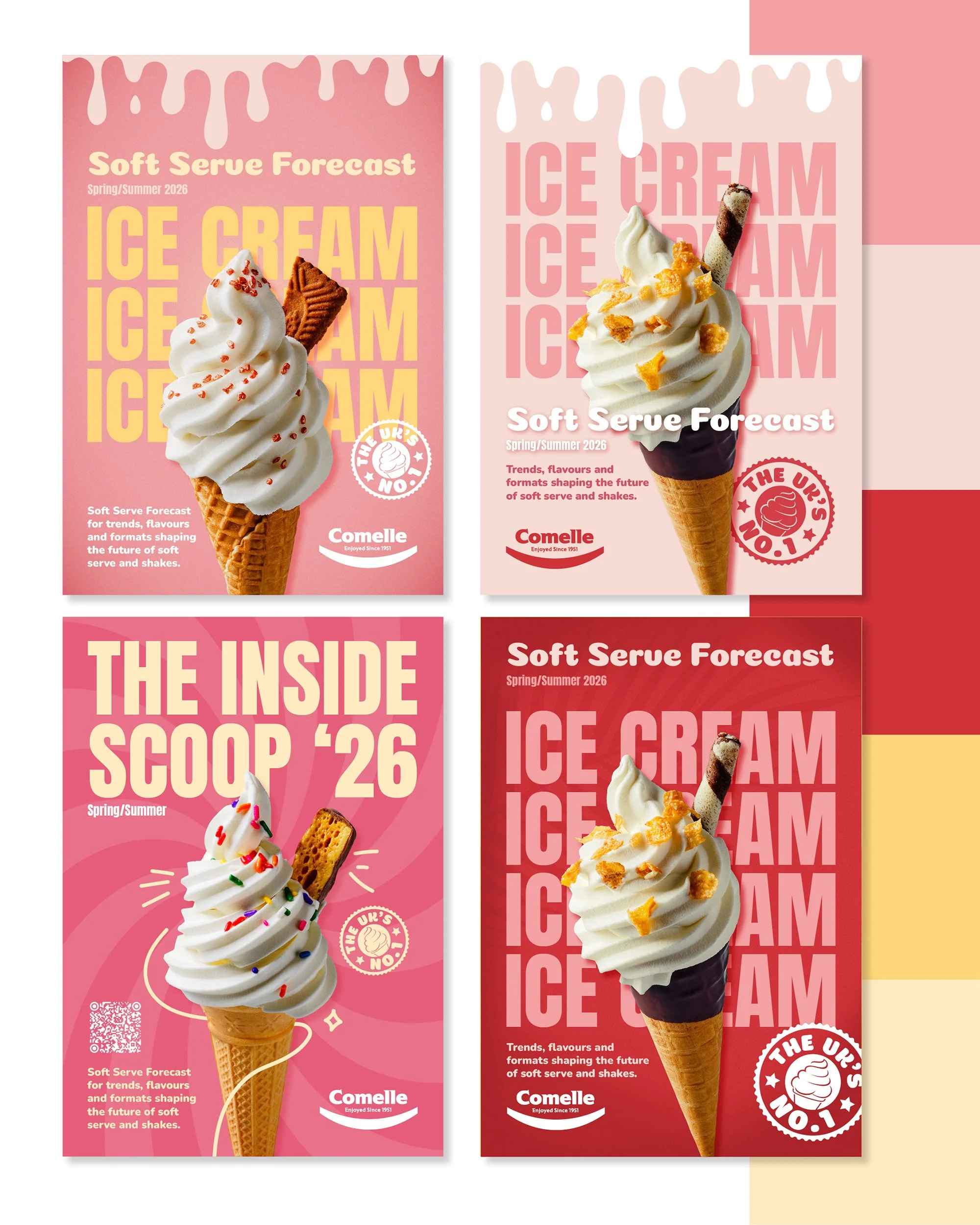
Campaign assets and web banners to promote the report
Website landing page graphics
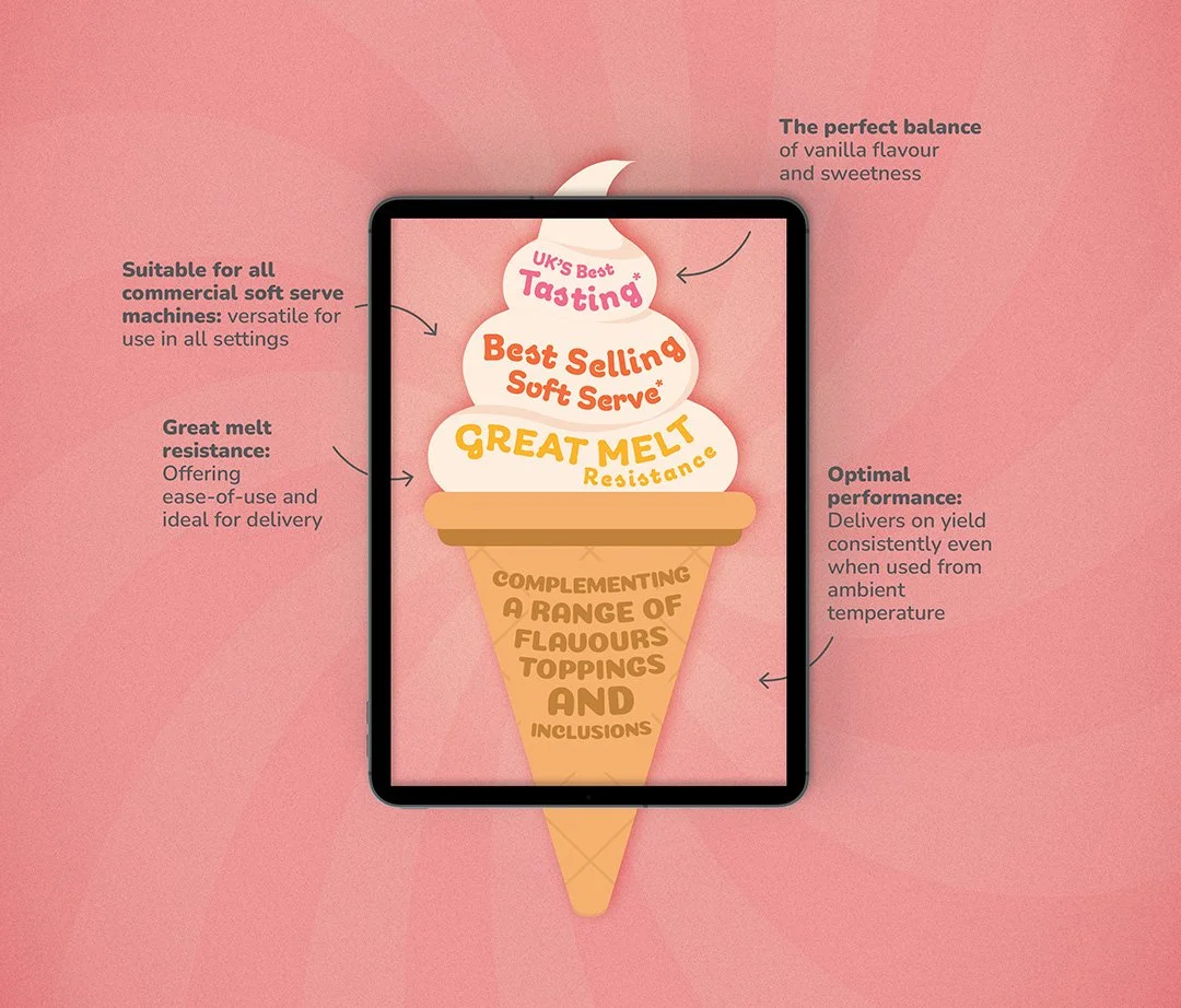
Infographics and supporting graphics display at the exhibition
Results
A big thank you to the team at William Murray PR & Marketing for trusting me with such an exciting piece of print-led creative. In an increasingly digital world, it was a refreshing opportunity to create something tangible, considered and designed to have a life beyond the screen. I haven’t received the post-campaign metrics, so I’m unable to quantify the report’s ROI, but I’m incredibly proud of the role the design played in bringing Comelle’s new Soft Serve Forecast to life.
Stay tuned for autumn winter!